Welcome to the world of gray, where sophistication meets timeless elegance! As a designer, you’re always on the lookout for that perfect color to bring your vision to life. While there are many colors to choose from, gray is a versatile and often underappreciated choice. In this article, we’ll explore how to make gray, its psychological impact, and how to incorporate it into your designs for stunning results.
Gray is often considered a neutral color, as it is neither black nor white. Its varying shades can offer a soothing, calming balance to more vibrant colors, or it can stand on its own as a bold statement. Gray is a refined and classic choice for any design project, whether it’s graphic design, fashion, or interior spaces.
The elegance and flexibility of gray make it an excellent choice for anyone looking to create a sophisticated design. But first, let’s dive into the psychology behind gray and why it has such a powerful effect on our emotions and perceptions.
Contents
- 1 The Psychology of Gray in Design
- 2 Understanding Color Theory: How to Make Gray
- 3 Digital Techniques for Making Gray
- 4 Gray Color Palettes for Sophisticated Designs
- 5 Tips for Incorporating Gray into Your Designs
- 6 Gray in Interior Design: Examples and Inspiration
- 7 Conclusion: Embracing Gray in Your Design Projects
The Psychology of Gray in Design
Colors have the power to evoke emotions, and understanding the psychology behind them is crucial when creating a design that resonates with your audience. Gray is often associated with neutrality and stability, making it an excellent choice for grounding more vibrant colors or creating a sense of calm in a space.
In addition to its calming qualities, gray can also symbolize sophistication, elegance, and authority. As a designer, using gray in your designs can help convey a sense of professionalism and refinement that other colors may not achieve. Gray can also represent practicality and maturity, making it ideal for designs that are meant to appeal to a more mature or discerning audience.
However, it’s essential to be mindful of the potential negative associations with gray. It can sometimes be seen as dull, drab, or even depressing. To avoid these negative connotations, consider the specific shade of gray you’re using and how it interacts with other colors in your design.
Understanding Color Theory: How to Make Gray
Now that you understand the psychology behind gray let’s explore how to make gray using color theory. Color theory is a fundamental aspect of design and will help you create the perfect shade of gray for your projects.
Mixing Gray Using Primary Colors
One way to create gray is by mixing the three primary colors: red, blue, and yellow. When you combine these colors in equal parts, you’ll get a neutral gray. However, you can also experiment with different proportions of primary colors to create various shades of gray. For example, mixing more blue and less red and yellow will result in a cooler gray, while using more yellow and less blue and red will produce a warmer gray.
To mix gray using primary colors, you’ll need a color medium such as paint, pastels, or colored pencils. Begin by adding equal amounts of red, blue, and yellow to your mixing surface or palette. Mix the colors together until you achieve a uniform gray shade. You can then adjust the proportions of each primary color to create different gray shades.
Creating Gray Shades with Complementary Colors
Another way to create gray shades is by mixing complementary colors. Complementary colors are those that sit opposite each other on the color wheel, such as red and green, blue and orange, or yellow and purple. Mixing complementary colors in equal parts will result in a neutral gray, while adjusting the proportions of each color will create varying gray shades.
To create gray using complementary colors, choose two colors that sit opposite each other on the color wheel. Mix them together in equal parts, and adjust the proportions as needed to achieve the desired gray shade. This method is particularly useful for creating more nuanced and unique gray shades that you might not be able to achieve using primary colors alone.
Digital Techniques for Making Gray
In the digital world, creating gray is as simple as adjusting color values on your computer or design software. There are several ways to make gray using digital techniques, including using RGB values, HEX codes, or the HSL color model.
RGB Values
RGB stands for Red, Green, and Blue, which are the primary colors of light. In digital design, colors are created by combining these three colors in various amounts. To create gray, you’ll need to set the values of red, green, and blue to be equal. For example, an RGB value of (128, 128, 128) will produce a medium gray. Adjusting these values will result in different shades of gray.
HEX Codes
HEX codes are another way to represent colors in digital design. A HEX code is a six-digit combination of numbers and letters that corresponds to a specific color. To create gray using HEX codes, you’ll need to use equal values for red, green, and blue. For example, a HEX code of #808080 represents a medium gray. Like with RGB values, adjusting the numbers and letters within the HEX code will produce different gray shades.
HSL Color Model
The HSL color model stands for Hue, Saturation, and Lightness. In this model, gray is created by setting the saturation value to 0%. Adjusting the lightness value will then produce different gray shades. For example, a lightness value of 50% will result in a medium gray, while a higher lightness value will create a lighter gray, and a lower lightness value will produce a darker gray.
Gray Color Palettes for Sophisticated Designs
Now that you know how to make gray, it’s time to explore some stunning gray color palettes that you can incorporate into your designs. Gray is incredibly versatile and can be easily combined with other colors to create a variety of sophisticated and timeless color schemes.
- Classic Monochrome: This palette consists of varying shades of gray, from light to dark. It creates a cohesive and elegant look that’s perfect for minimalist designs or when you want to evoke a sense of calm and sophistication.
- Gray and Pastel: Combining gray with soft pastel colors, such as blush pink or pale blue, creates a soothing and romantic feel. This palette is perfect for designs that need a delicate touch or want to convey a sense of serenity.
- Gray and Jewel Tones: Pairing gray with rich jewel tones, like emerald green or deep purple, adds a sense of luxury and opulence to your designs. This palette is ideal for creating a bold statement or when you want to add a touch of drama to your design.
- Gray and Earth Tones: For a more grounded and organic feel, combine gray with earthy colors like warm browns, tans, and beiges. This palette is perfect for creating a natural, harmonious look that’s both sophisticated and inviting.
Tips for Incorporating Gray into Your Designs
Incorporating gray into your designs can add a touch of sophistication and elegance to your projects. Here are some helpful tips to keep in mind when working with gray:
- Balance: Gray can be a powerful color, but it’s essential to strike the right balance between gray and other colors in your design. Use gray strategically to create depth and dimension or to add a sense of calm and stability.
- Contrast: When working with gray, consider its contrast with other colors. Lighter grays can provide a subtle contrast against darker colors, while darker grays can create a more dramatic effect when paired with lighter colors.
- Undertones: Gray can have warm or cool undertones, which can affect how it interacts with other colors in your design. Consider the undertones of your chosen gray shade and how they will work with the other colors in your design.
- Experiment: Don’t be afraid to experiment with different shades of gray and various color combinations. You might be surprised at the stunning results you can achieve by incorporating gray into your designs.
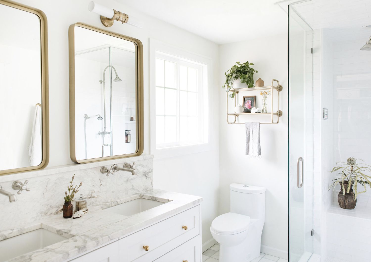
Gray in Interior Design: Examples and Inspiration
In interior design, gray is a popular choice for creating sophisticated and timeless spaces. Here are some examples and inspiration for incorporating gray into your interior design projects:
- Gray Walls: A gray accent wall can create a sense of depth and dimension while providing a neutral backdrop for other colors and design elements.
- Gray Furniture: Gray furniture, such as sofas, chairs, and tables, can add a touch of elegance and sophistication to any space.
- Gray Textiles: Incorporating gray textiles, like curtains, rugs, and cushions, can create a sense of unity and cohesion in your design.
- Gray and Metallic Accents: Combining gray with metallic accents, like gold or silver, can add a touch of glamour and luxury to your space.
- Gray in the Kitchen: Gray cabinetry and countertops can create a sleek and modern look in your kitchen, while also providing a timeless appeal.
Conclusion: Embracing Gray in Your Design Projects
Gray is a sophisticated and timeless choice for any design project. By understanding how to make gray and incorporating it into your designs, you can create stunning and elegant results that will stand the test of time. So go ahead, embrace the power of gray, and watch your design projects come alive with sophistication and style!